Managing Form Display
In ApplyCycle, staff arrange the fields applicants use to complete an application form. Staff reorder fields by dragging them or by setting row weights. Moving a field to the Disabled region hides it from the form. For list fields, staff can choose checkboxes or a select list for entering answers.
In addition to the ‘Manage Fields’ page, each application type has a Manage Form Display page. This is where you configure the appearance of the fields on the application form, including the field order.
Ordering and Hiding Fields
To change the order of the fields, grab the crosshair icon and drag the field up or down. Press the ‘Save’ button at the bottom of the page when you are finished.
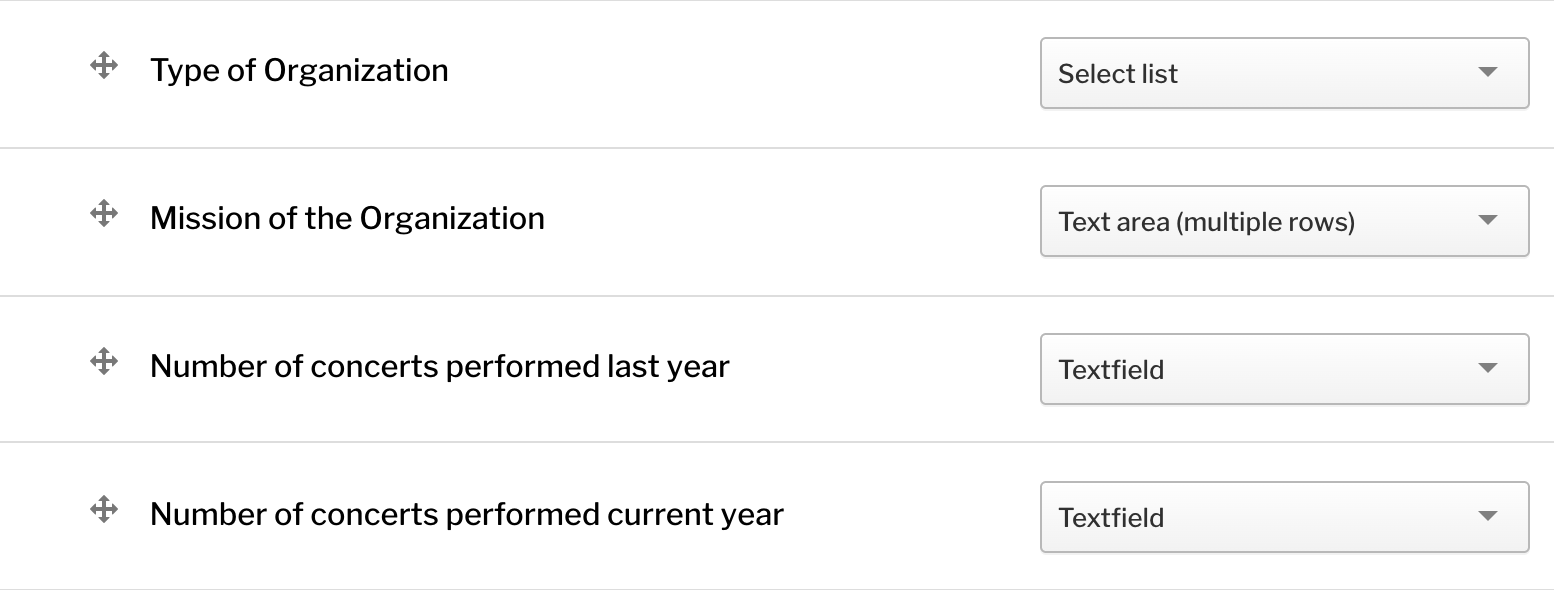
If you have trouble dragging the fields, you can press the ‘Show row weights’ button above the table. This will remove the crosshair icons and instead give you ‘Weight’ textfields. Larger weight values sink downward and smaller values float upward relative to each other. Adjust the weight values and press Save.
To remove a field from the form, you can either drag it to the ‘Disabled’ section toward the bottom of the table or you can change its ‘Region’ to ‘Disabled’ in the Region column.
Field Groups
Field groups can be used to group similar fields together on the form in ways such as vertical tabs and HTML elements. By default your application will contain a field group container 'Application' containing field groups 'General' and 'Admin Only.'
'Admin Only' Field Group
Click the gear beside the Admin Only field group to see that this field group is configured to allow only Editors to view it on the application form. Place any additional admin only fields here.
'General' Field Group
Click the gear beside the General field group to rename it as desired. You won't see this section on your application until you place a field into it.
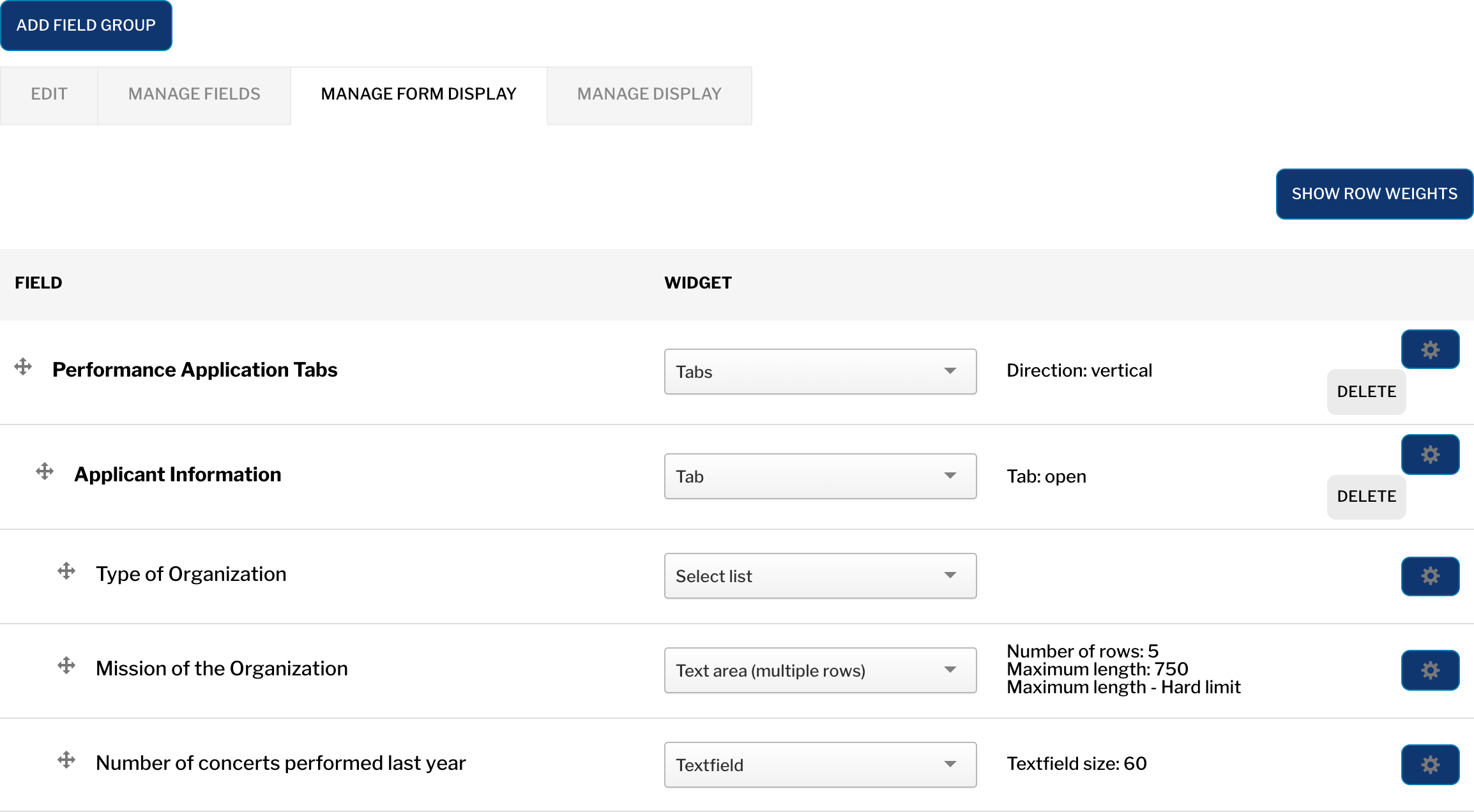
To place a field into a field group, first create the field (see Adding Fields to Applications), then on the Manage Form Display page, drag the field below and to the right of the Field Group so that it appears slightly indented and Save the page.
Adding a Field Group
It's a good idea to split your application into multiple field groups to make it more organized and less visually overwhelming. To add more field groups, click ‘Add a New Group’ and choose a type of 'Tab'. After you create your field group, drag it below and to the right of the 'Application' field group container so that it appears slightly indented and Save the page.
Once you have your groups created you will need to organize the fields and groups within the display hierarchy to your desired outcome. The tabs group container should be set to the outermost level. The tab groups (vertical tabs) should be set as children to the tabs container. The individual form fields should be set as children to the desired vertical tab.
Widgets
Each field type has its own options for ‘widgets’, which are the form elements shown on the form. For example, a List (text) field can use either a Checkboxes or a Select List widget. Some widgets have additional settings you get to by clicking on the gear icon.

See your widget options for each field on the Manage Form Display page. Some field types only have one widget option.
Some common widget choices:
Select list vs. Check boxes/radio buttons: If the applicant is only allowed to choose a single item, a select list is nice and compact. However if they can choose multiple items, checkboxes are easier to use. Radio buttons will appear instead of checkboxes if the field allows only a single value.
Number field vs. Number with commas field: Number fields do not allow commas, which can confuse applicants. For fields where they are likely to enter in commas, use the ‘Number with commas’ field widget.